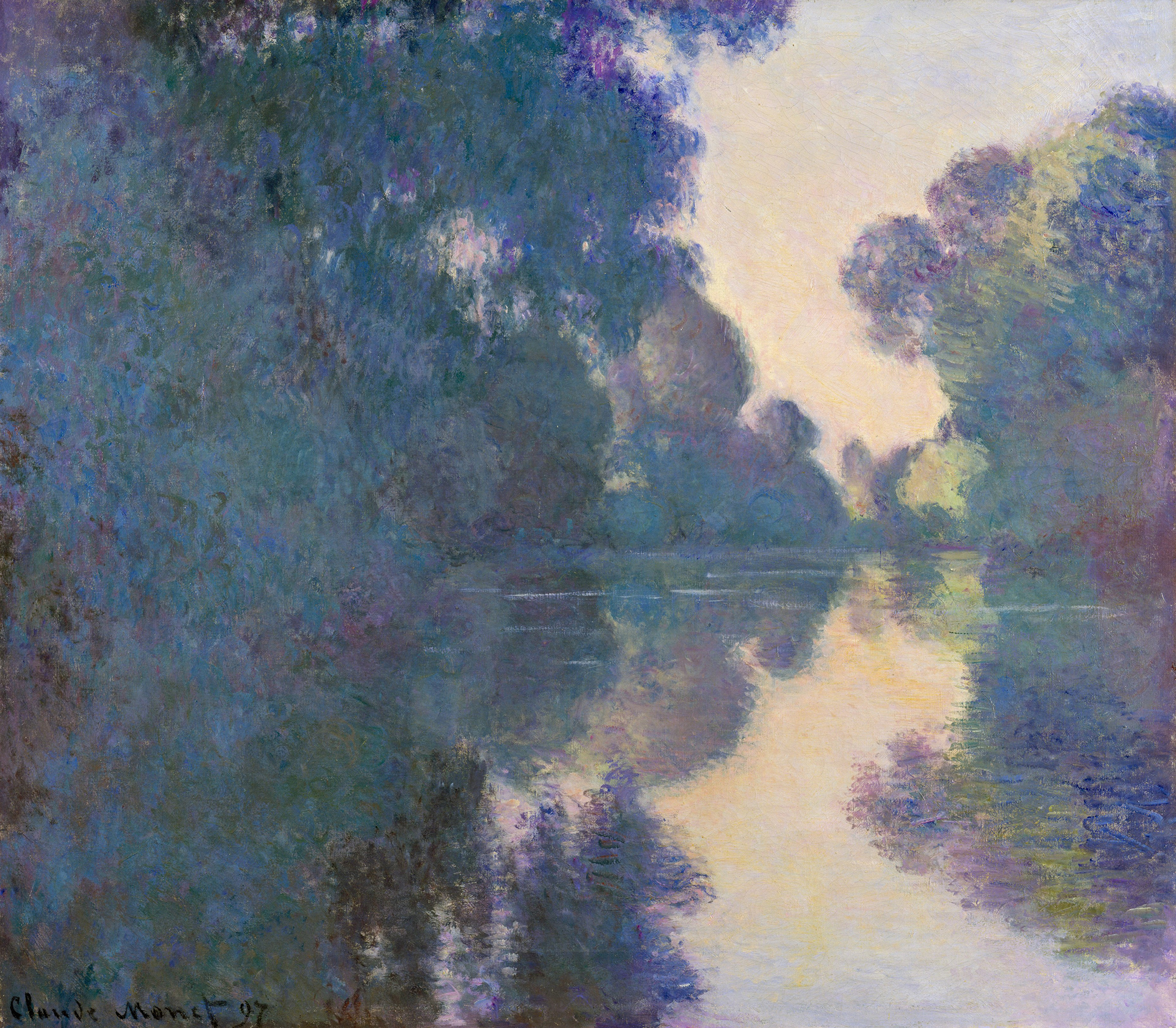
Morning on the Seine near Giverny, by Claude Monet, 1897. The Metropolitan Museum of Art, Bequest of Julia W. Emmons, 1956.
English-speaking schoolchildren nearly had to remember the order of the rainbow colors with the mnemonic roy g. bip. When Newton first began his optical experiments seeing the sun’s white light scattered by his prism, “purple” was the name he used for the color he saw at one end of the spectrum. Later he called that color “violet-purple.” Then just “violet.” roy g. biv it became.
It was not that Newton’s color discrimination became sharper over time. In fact it was never very good. It was that purple didn’t fit comfortably into his theory. Purple is a color that has to be mixed from blue and red pigments, but blue and red, as colors of light, are on the opposite sides of the spectrum and so never overlap when white light gets separated into its component colors. For Newton, purple then posed a problem. Enter Violet.
Maybe it doesn’t matter much what we call the colors we see. It isn’t clear, in any case, that any one person sees exactly the same color another does, and all our color names are merely tentative and approximate labels for complex visual sensations. One person’s violet might be another’s lilac or lavender or amethyst or maybe just purple. And though industrial color manufacture has provided us now with an impressively differentiated color vocabulary, there are still many more colors, at least shades, tones, and tints, than we have words for them. The French word violet is often translated into English as “purple,” but pourpre often gets translated as “purple,” too—although for French speakers pourpre usually names a purple closer to red than violet does. Burgundy perhaps.

But violet seems to differ from purple in whatever language—not so much as a different shade of color than as something more luminous: perhaps a purple lit from within. Violet is the shimmering, fugitive color of the sky at sunset, purple the assertive, substantial color of imperial robes. Purple were the sails of Cleopatra’s barge, as both Plutarch and Shakespeare tell us; but Cleopatra’s eyes, as everyone seemed to notice when Elizabeth Taylor played her in the film of 1963, were violet.
And modern painting began with that luminous violet. In Paris in 1874. On April 15.
Well, not really. But if we need one, that is at least a plausible starting date. Stories of origin are almost always false. Everything always begins earlier. This did, too. But that was the day that a group of artists, who called themselves “the Anonymous Society of Painters, Sculptors, Engravers, etc.,” opened the first of eight exhibitions they would organize between 1874 and 1886 as an alternative to the official Salon de Paris. Many of those who showed their work would remain anonymous. Some, of course, would not: Eugène Boudin, Paul Cézanne, Edgar Degas, Claude Monet, Berthe Morisot, Camille Pissarro, Auguste Renoir, Alfred Sisley.

These would become “the pioneers of the painting of the future,” as a critic, Émile Cardon, prophesied in his review in La Presse. For him, however, this was intended not as a compliment to their artistry but as a condemnation of contemporary taste. Impressionism in his mind was nothing more than doodling with paint. “Dirty three-quarters of a canvas with black and white, rub the rest with yellow, dot it with red and blue blobs at random, and you will have an impression of spring.”
Critics were outraged by the loose, broken brushwork that made the paintings seem to many viewers more like sketches than proper paintings. Monet’s Impression, Soleil Levant, the painting often thought to provide the name for the movement, was mocked by the critic Louis Leroy in Charivari: “Wallpaper in its embryonic state is more finished than that seascape.”
But it was really a color that offended the art world: violet. Not the yellow, red, and blue that Cardon had noted but the violet that was now seemingly everywhere—at least on these canvases. Violet became the name for the shock of the new.
In 1881 Jules Claretie quoted Manet’s prediction that “within three years everyone will be painting violet” and lamented that this was all too likely to come true. Maybe it already had. An exasperated French novelist, Joris-Karl Huysmans, complained that “earth, sky, water, flesh” were inevitably now the color of “lilacs and eggplants.” Faces were rendered “with lumps of bright violet paint.” Ambient light now appeared only “in harsh blue and garish lilac.”

It was an outrage. In 1878 Théodore Duret wrote: “In summer sunlight reflected by green foliage, skin and clothing take on a violet hue. The impressionist painter paints people in violet forests, so the public loses all control. Critics shake their fists and call the painter a vulgar scoundrel.” Still, violet became the color of choice. The Irish critic and novelist George Moore, thinking about why violet seemed to dominate the impressionists’ paintings, replied with a shrewd insight into the psychology of artistic fashion: “One year one paints violet and people scream, and the following year everyone paints a great deal more violet.” Huysmans had a simpler explanation: “Their retinas were diseased.”
Or maybe it was their brains. August Strindberg commented on the purplish palette of the impressionists and wondered if perhaps they all were “mad.” Cardon had speculated about possible “mental derangement.” Alfred Wolff, the art critic for Le Figaro, Paris’s leading newspaper at the time, wasn’t quite prepared to offer a clinical diagnosis but clearly recognized the possibility: it was no more likely that one could make Pissarro “understand that trees were not violet” than that one could cure a “lunatic” who believed himself to be the pope.
Other critics were less scandalized and saw the color merely as a fashionable affectation. One sniffed that impressionism seemed to demand nothing more from an artist than painting the sky violet. The increasingly familiar bluish purple tones of the paintings regularly drew comment, almost always negative. In a review in the Gazette des Beaux-Arts, Alfred de Lostelot, an early defender of impressionism, noted the painters’ unusual dependence on the violet color (and even conjectured wildly that some of them might be able to see ultraviolet rays). “Monet and his friends,” he said, granting Monet pride of place in the movement, oddly seemed to see the whole world in violet. “Those that love the color will be delighted,” he said, but he reluctantly acknowledged that most gallery-goers did not.

If not nearly as ubiquitous in the paintings as the exasperated responses would suggest, violet did differentiate the palette of impressionism from any paintings seen before. And gradually people did come to “love the color.” Perhaps it was a scandal, but as the narrator says in Émile Zola’s novel His Masterpiece, it became the painters’ “gay scandal”—a willful “exaggeration of sunlight” that offered welcome relief from “the black pretentious things” of the official salon.
Not only did violet provide a distinctive new color for modern art, but strangely, at least for some, it offered a distinctive new color for the world. Nature itself suddenly began to appear “absolutely modern,” according to Oscar Wilde in “The Decay of Lying,” looking like “exquisite Monets and entrancing Pissarros,” with landscapes and skies made up of “strange blotches of mauve” and “restless violet shadows.”
It is perhaps not quite as perverse an argument as it first appears, or maybe it is: nature imitating art. But the impressionists allowed—no, trained—our eyes to see nature differently: to see it dressed in color tones and modulations of light that, as Wilde pronounced, “did not exist till Art had invented them.”
This isn’t a claim that impressionists made for themselves. They didn’t make any claims at all. Theirs was a revolution without a manifesto. It didn’t begin as a theoretical program, and to the degree that it became one, each painter acted on it somewhat differently. The paintings were its statements—along with some letters and a few interviews, though most of these were given after the painters had stopped painting as impressionists.

And the label wasn’t even their own, though eventually they would adopt it. At first, they called themselves “independents,” then “intransigents.” Only for their third exhibition did they embrace the term “impressionists” that the critics had already used. “They are impressionists,” said Jules-Antoine Castagnary in a review in Le Siècle in 1874, “in that they render, not a landscape, but the sensation produced by the landscape.”
That is what almost everyone has said about them: that their subject was the spontaneous visual experience of the world rather than the world itself. They wanted, it was said, to re-create the immediate visual impression of that landscape, produced by the light in the very instant before the brain fully organized the scene.
But even this isn’t exactly right. Obviously they were not painting realistic images of the world as it objectively exists. But neither were they representing immediate visual sensations, even though Monet would say late in his life that his originality lay in his ability to record “impressions registered on my retina.” These are paintings by artists “drinking in the intoxicating effects of the sun,” in Philippe Burty’s wonderful phrase in a review published in 1874 in La République Française. Landscapes became lightscapes. But we shouldn’t underestimate either the intoxication or the fact that the artists usually returned soberly to the studio to complete their paintings. They were committed to neither optics nor objectivity.

Rather, they were painting something in between. It isn’t that they painted objects as we see them. They painted the luminous air and light that exists in between the eye and those objects. “I want to paint the air in which the bridge, the house, and the boat are to be found—the beauty of the air around them—and that is nothing less than the impossible,” Monet said in 1895 in an interview while visiting Norway. “To me the motif is insignificant. What I want to reproduce is what lies between the motif and me.”
What “lies between” is something real, although it is transparent and insubstantial. It affects the appearance of objects, but it is not itself normally perceived. To paint it may very well seem to be “impossible,” as Monet said. But it was exactly what he and the other impressionists wanted to portray: not objects but what Cézanne called “the atmosphere of objects”—light and air, which demand color, not contour. The objects themselves mattered only as they provided the particular occasions and some necessary scaffolding for painting the in-between.
And surprisingly the in-between seemed to have a characteristic color. “I have finally discovered the true color of the atmosphere,” Manet would crow near the end of his life: “It is violet.”
From On Color by David Scott Kastan with Stephen Farthing, published by Yale University Press in May 2018. Reproduced by permission.