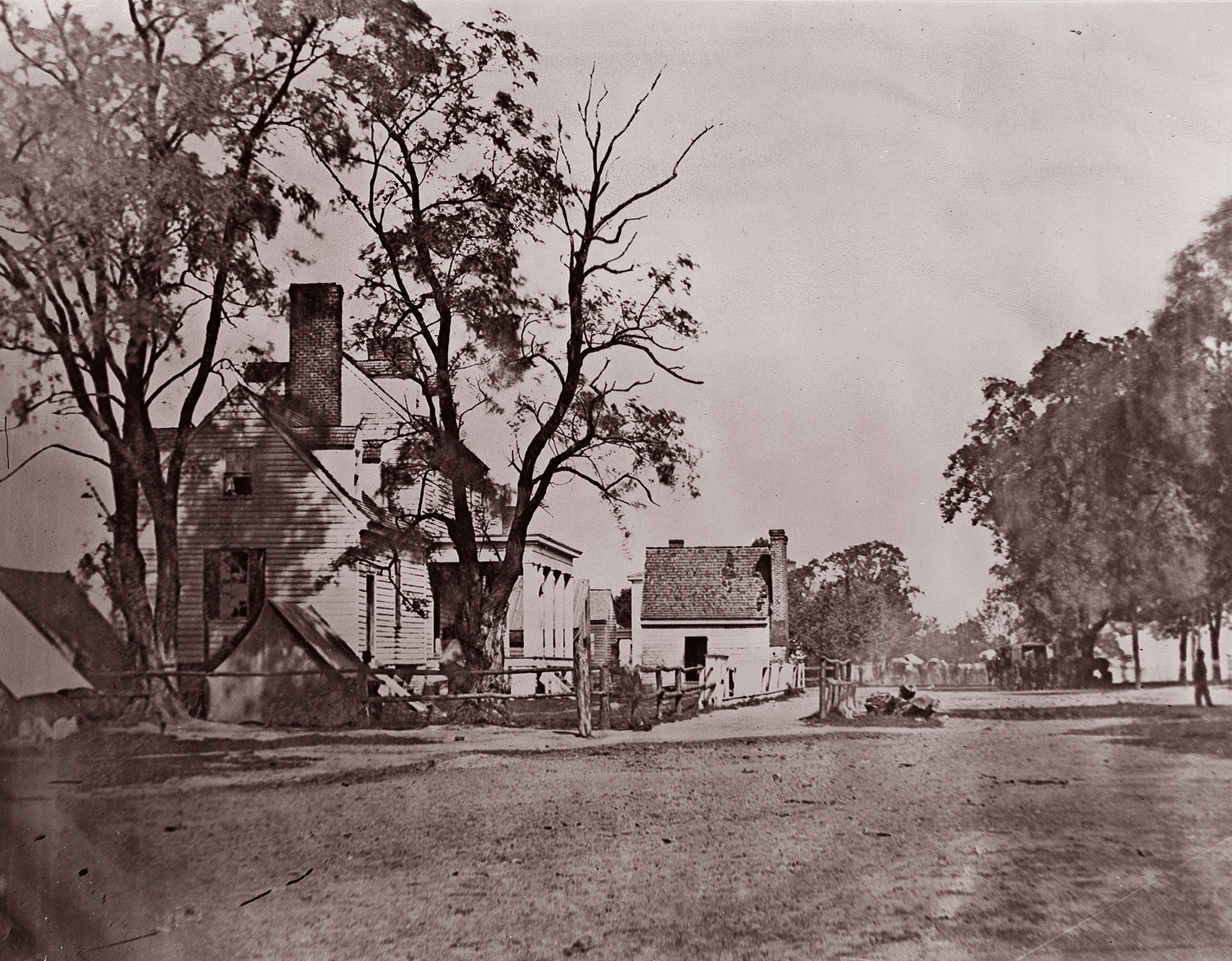
Headquarters of Capt. H.B. Blood, A.Q.M., at City Point, Virginia, c. 1861. Photograph by Andrew Joseph Russell. The Metropolitan Museum of Art, Harris Brisbane Dick Fund, 1933.
Ebullient announcements of photography’s invention were tempered by one shortcoming: the medium’s lack of color. Painter and telegraph inventor Samuel F.B. Morse likened the French artist Louis-Jacques-Mandé Daguerre’s work to the chiaroscuro of mezzotint prints. Another observer noted, “in the absence of color they are as perfect images of the objects they represent, as are those which are seen by reflection from a highly polished surface.” Of the first five patents issued in the United States related to photography, three concerned the medium’s colorlessness. These initial improvements described modes of adding color to the surface of the daguerreotype by hand painting with pigments or through a galvanizing process. The recording of natural color was the desideratum of early photography, although it remained largely unattainable until the twentieth century.
Nearly every book-length manual published in the nineteenth century included a chapter on coloring or painting photographs. How-to articles on adding color also proliferated in the photographic press. One writer reasoned, “The want of color is chiefly felt in portraits; this deficiency imparts a cold and almost cadaverous air; it renders the likeness less perfect, and often gives an appearance of greater age.” This author and many others detailed methods for preparing the surface of the image, recommending types of brushes and the precise pigments to use on each area of the picture. These lists reveal the dominant racial assumptions of the time, providing a single formula for “flesh tints,” while offering extensive and varied advice on how to color studio elements from backdrops and drapery to silks, feathers, and furs.

Most studios practiced an elaborate division of labor during this period, employing assistants to prepare the plates, operators to work the camera, and painters to complete the pictures after development. Only occasionally were these additional participants named, as a critic lamented following an 1857 exhibition in New York: “We regret that the artist has not been permitted to attach his name to each picture, that we might give the credit for whatever skill is evinced in its execution…We cannot consider that the exhibitor should receive all the praise. It should be divided according to merit.” By “artist,” this author meant the painter, not the camera operator or the owner of the photographic studio. As a result of this imbalance, the author concluded that hand-colored photographs should not be judged in the contest because their makers remained unnamed.
The perception of a division, or even a conflict, between the photographic and the painterly elements in pictures was common during the peak popularity of painted photographs. Many how-to authors prefaced their coloring instructions by disparaging painted photographs, claiming that they resorted to tinting photographs only to satisfy the whims of public taste. An article in Humphrey’s Journal reasoned, “Colored photographs occupy an undeservedly questionable situation: the artist curls his lip at them, and the photographer regards them with a sneer. The one says they are no paintings, the other that they are no photographs; thus the art of photographic coloring, unrecognized by either, must seek consolation in the fact that it is embraced nonetheless eagerly by both.” Humphrey’s even advised potential exhibitors against showing colored daguerreotypes at photographic competitions, maintaining, “There is not a skillful operator who will pronounce a colored impression equal to one with a fine, clear, brilliant-toned impression untarnished by the brush.”

Among most photographers and critics, the chief criticism of hand painting was that it obscured the photographic nature of the image, sacrificing truth-value for artistic effects. Tasteful coloring was meant to be subtle; transparent hues should enhance, but not conceal, photographic detail. Photographer Henry Hunt Snelling, who would later become editor of the Photographic Art Journal, wrote in his own instructional manual, “I very much doubt the propriety of coloring the daguerreotypes, as I am of the opinion that they are little, if any, improved by the operation, at least as it is now generally practiced.” Others accused less skilled studios of using hand painting to cover up photographic defects, such as poor focus or limited tonal range. A review of painted daguerreotypes at London’s Great Exhibition argued, “The process of coloring photographs is, it appears to us, exceedingly detrimental to the art. Bad daguerreotypes may be painted up and passed off as tolerably successful photographs.”
Looking back over photography’s first decade, editor and publisher Samuel Humphrey wrote in 1849, “Though in itself a small affair, it [the process of coloring] has created more popular clamor than all other improvements combined.” Coloring, tinting, painting, or “hand painting,” as it came to be called after the introduction of mechanical and chemical methods of recording coloring, endures as one of the prime aesthetic markers of early photography. Despite purists’ criticisms, hand coloring remained popular from the early 1840s through the craze for card portraiture that lasted into the 1880s. By 1894, however, Wilson’s Cyclopedic Photography noted, “Formerly the demand for tinted and colored photographs was considerable; today, however, it can hardly be said to exist.” In its heyday, hand coloring was recognized with all the fervor of any fashionable trend, attracting attention and derision in almost equal measure for nearly half a century.
The subjects of early photographs lived all their days under cloudless skies. Neither daguerreotypes nor Talbot’s paper negative process could easily capture drifting clouds. One writer reflected on the daguerreotype era, noting that “the sky was represented by a dull, uniform tint of a slaty blue color, without perspective or depth, and the complete want of every living creature gave the pictures a deserted and mournful appearance.” Initially it was assumed that representing clouds in photographs was impossible, and some operators took to painting them in with ink on the back of paper negatives before printing. With improvement in lenses and the invention of the collodion process, the fleecy sky seemed to be within reach by the 1850s. Collodion’s color sensitivity was limited to blue light, though, so balancing the exposure for the blue sky against the lengthier one required for the green landscape remained a challenge. During this period, instructional manuals and photographic journals regularly printed recommendations for how to achieve cloud effects, “whether by natural means or dodges,” as one photographer put it.
Not only were photographers frustrated by the lack of clouds, which could make a stormy seascape roil beneath a paradoxically empty sky, but they also despaired of what remained in place of the clouds. When the sky was overexposed, the thin negative revealed the blotchy and streaky evidence of chemical pours on the plate. This defect was considered so grave as to completely ruin a photograph. One critic argued that such “streaks…often spoil fine pictures and oblige us to throw them aside.” Others noted that the clear negative revealed a “heavy, dingy, blotty proof” or complained that the sky appeared “dirty.”
The first answer to these woes called for the photographer to simply paint over the offending part of the negative or black it out with india ink, so that no detail at all appeared in the positive print. This advice was popular well into the 1880s, when an article for the burgeoning class of amateur photographers suggested, “The photographer should never rest satisfied with smutty dull skies, trusting to his steady hand to block them out of the negative with opaque.” The technique was easily accomplished when the horizon was regular, but the introduction of any protruding bits, especially foliage, complicated the task significantly.

A still more involved solution to the absence of clouds required that the photographer make two negatives, exposing one for the landscape and the other for the sky, then combine the pair in printing. Some made cloud studies at different sites, should clouds in the original view prove unphotogenic. Occasionally writers warned that “there will always be an extreme difficulty in harmonizing these clouds with a view to which they do not belong,” but combination printing, as it was called, was widely employed for landscapes throughout the nineteenth century. The French photographer Gustave Le Gray was celebrated internationally for his dramatic seascapes, which featured large cloud masses, often created through combination printing.
Even after the 1860s, when it became more feasible to arrest the movement of clouds with improved photographic methods, the technique of combination printing remained popular. A prominent British photographer complained that combination printing was inartistic, claiming “it is more legitimate to wait till a suitable cloud comes on the scene than to select a suitable cloud from a box and print it in.” An enthusiastic amateur responded in print, “Printing in clouds from a separate negative is, to my thinking, when properly done, a very artistic improvement, and I fail to see why any exception should be taken to it. Skies utterly inappropriate may be added, and frequently are, but that is no argument against their use in a proper manner.” Indeed, photographers who managed to include such atmosphere in their prints were widely admired, regardless of how the effects were attained. Reporting from the 1873 international exhibition in Vienna, the critic Hermann Vogel praised a group of Yosemite photographs, noting Eadweard “Muybridge, above all others, is distinguished by superb cloud effects, which, in these large pictures, look extraordinary fine.”
. J. Paul Getty Museum, Los Angeles. Digital image courtesy of the Getty’s Open Content Program.")
Apart from picking clouds out of a box, photographers could also mask the sky during exposure to achieve the proper balance between light and dark areas of the composition. By the mid-1880s, this was among the leading recommendations for amateurs doing landscape work: “Most operators employ the flap in front hinged from the top of the lens, which, by shading the sky, prevents it from being over-timed. Care must be taken to keep the flap in gentle motion, otherwise a rigid, distinct line will be formed on the plate.”
Balancing the exposure of a bright sky against the landscape remains a challenge today, as humans perceive a much wider dynamic range than even the best digital cameras. Graduated filters, which reduce the amount of light entering the top half of the lens and transition smoothly to a clear or neutral lower half, have been in use since the early twentieth century and are still popular among contemporary landscape photographers who wish to record the clouds as they are rather than picking them out a box (or digital file) later.
Excerpted from Good Pictures: A History of Popular Photography by Kim Beil, published by Stanford University Press. © 2020 by the Board of Trustees of the Leland Stanford Junior University. All Rights Reserved.